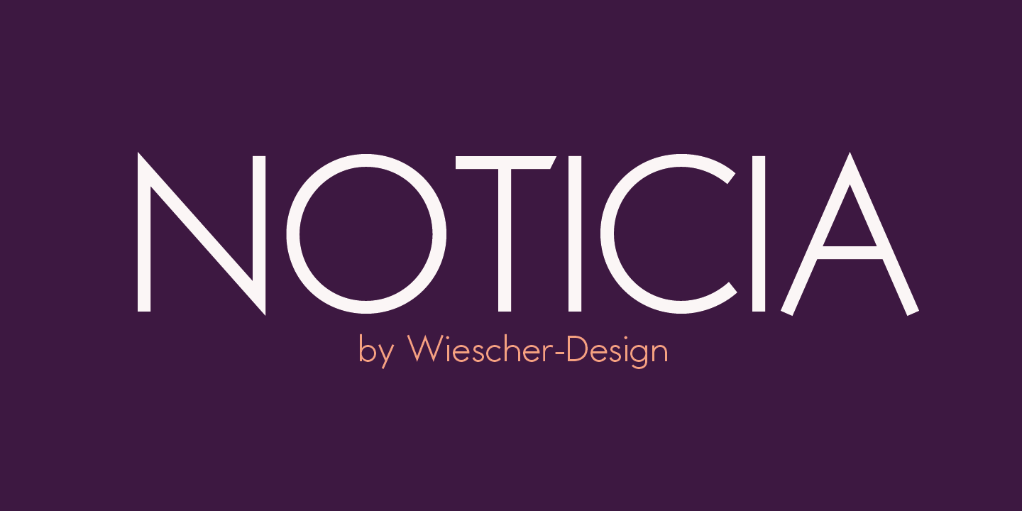
»NOTICIA« a new Sans based on modernistic, constructivist letterforms of the »Bauhaus« era. The names Herbert Bayer and Paul Renner come to mind as design beacons of that time. »NOTICIA« is different in its proportions and long ascenders and desenders make for good readability, slanted endings on some horizontal strokes give it more dynamic. The font also has an additional set of medieval ciphers »NOTICIA« brings the old forms up to todays standards in typography.


Type design has become easier in the last 30 years, more people are trying their hand at it. Which results in more new fonts that fill gaps
but each new font creates two new gaps, or reasons for new fonts.


»BLITZ« is very readable despite it being top heavy, thin on the low end and thick on the upper end. I always wanted to design a typeface that was top heavy, but I never knew how not to make it look like Antique Olive, until recently. The font gets a special shine because of this effect. And it stays readable despite its special design.


If you compare the designs of Herbert Bayer’s »universal alphabet«, Paul Renners »Futura«, and Adrian Frutigers »Avenir« (a.s.o. this list could be extended). And if you would not know when these fonts were designed, you could not say who influenced who. Or to put it straight, which »new« font is based on whose older one.

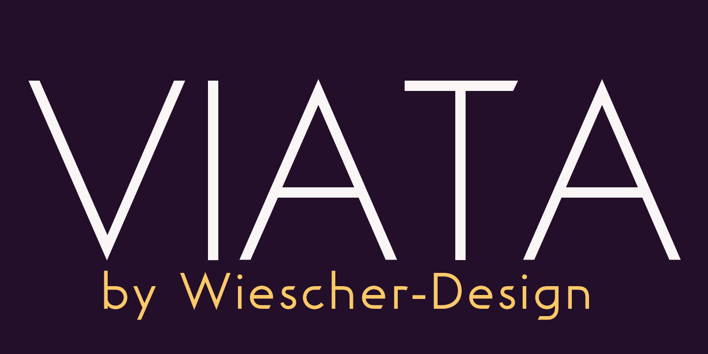
»VIATA« is my new experimental Sans based on the modernistic, constructivist letterforms of the »Bauhaus« era. »VIATA« has flat tops and round bottoms, which give the glyphs a very distinct form, slanted endings on some horizontal strokes give the font more dynamic. The font also has an additional set of medieval ciphers »VIATA« adds a new kick to the old forms.
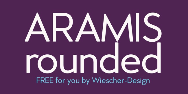
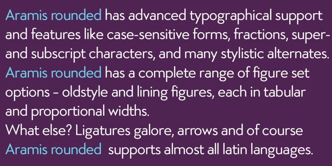
»ARAMIS rounded« is a work in progress. If you have been invited you can download your free font here: